
TYPOGRAPHIC INTERACTIVE
2025
RIVE
INTERACTIVE

Challenge
Create a 1080 x 1920 typographic interactive animation in Rive that highlights the beauty of Haiku poetry for Poets.org website.
scroll for process
What's a Haiku?
A Haiku is a Japanese poem that consists of 3 sentences with 5, 7 and 5 syllables. It's an old style of poetry that is short and to the point. It is often used to depict scenic nature as well as day to day scenarios.
RESEARCH
Poets.org is the first online resource available for poetry founded by Academy of American Poets. There is a variety of classic poetry as well as newer poems submitted by local poets. They strive for poetry accessibility for writers, readers and teachers.
Poets.org is very much rooted in New York, where it was founded, impacting the community directly in New York.

IDEATION
Haiku's touch on nature and beautiful sceneries. However, since Poets.org has such a presence in New York I decided to choose a poem based in New York and by a New Yorker I chose Strangers by Hillel Rosenshine which is written bellow.
What's the most iconic environment in New York city? The Subway of course!
So, in the spirit of New York I chose a poem depicting an experience in the subway.
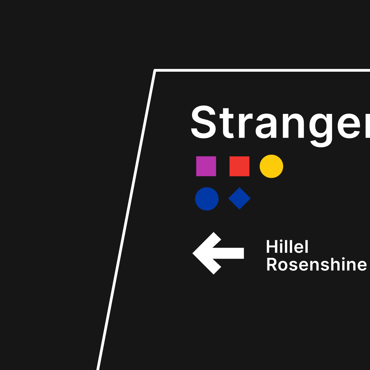
Strangers
by hillel rosenshine
Face seen across tracks,
We stare, and a train passes,
Face gone forever.


inspo

styleframe
Brick by Brick
01 CONCEPT
Reconstruct the poem to reveal the type within.
This would have each element within the design made up of typography. This would encourage participation with the poem enticing the viewer to unveil each word.


inspo

styleframe
Let's explore
02 CONCEPT
In the spirit of New York, let’s take a dive and explore the poem like the NYC subway.
This would have clean swiss design with playful movement. The dimension in this piece would be found through interaction.
let's explore
CHOSEN CONCEPT
The concept chosen was Let's Explore. Some things to consider is the incorporation of the subway aesthetic in terms of iconography and color. I have to be careful about having letters in the compositions that were decorative because it could confuse the viewer.
#0039A6
#FF6319
#FCCC0A
#6CBE45
#00933C
#B933AD
The colors and shapes used will mimic the design systems within the New York subway.
RIVE
Each line of the poem needs a moment of exploration within the interactive experience. Rive is a rising platform for interactivity with real time updates. The challenge with using Rive is making sure the interactivity works and is understandable to each viewer.
Interactions are put in place by using inputs and listeners which tell Rive where to look to trigger certain animations.


Here I am walking through the animation showing multiple types of interactions I used to carry forward the scene.
Animations like these indicate interactivity - Affordance

As you can see there are timelines like idle, hover, click and transition. When you are preparing for interactivity, you need to organize each timeline in a certain way. You need to make sure that the keyframes at the end and start of each timeline overlap.
The node tree set up I used is very linear. Since it is traveling through one space a linear node tree works well!
1st pass animation
I had everything blocked out to have a sense of how it will feel. For animation it felt too fast and needed more movement that expresses the calm moments that the poem describes.
I felt that in the design there could be more elements that were accurate to the NYC subway. I need to use accurate colors as well as structural details like tiling on the walls. There is also room for more exploration with compositions to create a sense of depth.
2nd pass animation
The animation still felt too fast and needed movement that expresses the weight of the words. The depth wasn't convincing with the movement of type. Since there is no z depth and a tight composition it made words illegible. I need a solution for this problem.
I had refined the design in terms of color and subway elements. I felt like the visual hierarchy was unclear in some parts. I need to develop more visual hierarchy and to follow rules given for subway iconography.
3RD pass animation
The animation has improved at this point quite a bit. Something to consider! Animating a line from the poem into frame twice, makes the reader read it twice. This isn't accurate to the poem! Reveal each line once. The timing can also be slower and smoother.
I had refined the design in terms of visual appeal. The type, however, looks pixelated and inhuman. I should select a typeface that feels like a person.
interactive!!
click around and see where you go.
final
The final outcome of the project is as shown on the right! The interactions engage viewers to start the animation and read as it plays on.
Please interact! There is sound so lower your volume as needed.
Any last words? hehe
Well.....I can say that interactivity is for sure interesting but painful! There are a lot of variables to think of and Rive being a new animation software for me was a challenge.